


What is Mobile First Indexing (MFI)? What Should Be Considered?
With the update made by Google in 2016, we met the concept of mobile-first indexing (MFI), i.e. mobile-first indexing. Before the Google update, when evaluating the crawling, indexing, and indexing systems of a website, the desktop version of that website was taken into account. However, with the update announced in 2016, it announced that it would consider the mobile version of websites in the crawling, indexing, and ranking systems of websites. Then, with the current announcement in 2020, it announced that the mobile-first indexing (MFI) update is now valid for websites all over the world.
First of all, I would like to talk about the details of the updates made in 2016 and 2020.
When we examine the update announcement made by Google in 2016, we can actually say that this update is due to the fact that users perform Google searches mostly on mobile devices. Stating that the user who searches on mobile devices encounters less content on the mobile page than the content on the desktop page, Google actually supports the principle of "having the content the user is looking for", which is one of its basic principles with this update. Google's main goal in this update is to ensure that all content such as structural data, breadcrumb structures, and category content on the desktop page is also included on the mobile page, thus supporting users to access higher quality content.
With the 2016 update, Google mentioned that this update is still in its early stages and announced that mobile-first indexing will be introduced for all websites in 2020.
So what is mobile-first indexing and how can we make our websites suitable for mobile-first indexing (MFI) and what are the things to consider about mobile-first indexing?
What is Mobile-First Indexing (MFI)?
Mobile-first indexing (MFI) is Google's use of the mobile version of a website when performing indexing, crawling, and ranking factors, or in other words, when determining the relevance of a query to a website. Creating websites suitable for mobile-first indexing means that all the content on the desktop version of the website is also available on the mobile website.
There are two different methods to make our website suitable for mobile-first indexing, using a different URL structure or using the same URL structure. Using a different URL structure means serving different HTML codes for each device via a separate URL, and in this configuration method, Googlebot uses the "User-agent" and "Vary" HTTP headers to redirect users to the appropriate version for the device they are using. If you are going to create a website with a different URL structure, this URL should be created with the "m" subdomain structure (www.m.example.com). In case the mobile version is presented under a different subdomain, the pages that the mobile pages refer to, in other words, the canonical tags must point to the desktop version.
If the mobile version will be presented with the same URL structure, one of the Responsive Design / Dynamic Serving structures should be used.
Responsive Design is a web design that makes website content look good from minimum to maximum on various devices or screen sizes. It is a design that creates the same HTML code in the same URL structure but in accordance with the screen sizes, regardless of the device on which the user visits the website. Google recommends Responsive Design because it has the easiest structure in terms of both design pattern and page maintenance. In addition, responsive design provides an advantage in terms of crawl budget efficiency.

Dynamic Serving is the serving of different HTML and CSS resources for the same URL on different device types. It uses the same URL regardless of the device on which the user visits the website. However, as in responsive design, different screen sizes are not offered in accordance with the type of device used. In this case, you may need to make some changes to your website because your website will look different on the mobile version than the desktop version in terms of size and design. In this configuration method, Googlebot uses the "User-agent" polling method and the "Vary: User-agent" HTTP response header to redirect users to different sizes of HTML.
How to Create a Website Suitable for Mobile-First Indexing?
You can test your website's suitability for mobile-first indexing with the mobile-first indexing test tool. So how to create websites suitable for mobile-first indexing (MFI)?
Structured Data Control
All of the structured data markups that you offer in your desktop version should also be available in the mobile version. For example, you should make sure that an organization schema or FAQ schema field that you use in the desktop version is also available to the user in the mobile version. You can compare structured data for both device types by adding your site URL to the structured data testing tool.
Robots.txt File Control
Robots.txt is a text file that tells search engine bots which pages they can or cannot access. So make sure that you use the same meta robots tag on both your mobile and desktop site versions and that your mobile version is accessible in the robots.txt file, otherwise Google will not be able to access your mobile site version, which will prevent the mobile version of your website from being crawled and indexed.
Content Control
Make sure the mobile and desktop versions have the same content. If a content on the desktop version is not available on your mobile version, you should add the same content for the mobile version. Otherwise, both the user and Googlebot will not encounter a content that they encounter in the desktop version in the mobile version. Since all indexing operations are performed on the mobile site, you may have problems indexing your content.
Meta Tags Usage Control
Make sure that the same meta title and description tags are used on the desktop and mobile versions of your site.
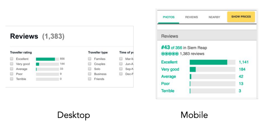
Visual Content Control
Make sure that the images you add to your mobile site are of the same quality as the images on the desktop site, do not add lower-quality images added for the mobile site. Make sure that the images you use on the mobile site are formats supported by Google and that the image alt text tags you use on the desktop version are used in the same way on the mobile site.
Video Content Control
Make sure that the video content on the desktop version is also used on the mobile version, the video content on the mobile site is not of low quality and is in Google-supported formats. Create video content to be added to the page content with <video>, <embed>, or <object> tags.
Product / Content Count Control
Make sure that the products you use on your website or the number of content presented to the user are the same on both the desktop and mobile versions.
Category Content Control
You should make sure that all category content offered on the website is also used in the mobile site version. Category content that is not used in the mobile version will not be indexed.
Breadcrumb Structure Control
You should make sure that the breadcrumb structures used in the desktop site version are used in the same place and in the same way in the mobile site version.
Pagination/ Infinite Scroll Structure Control
Make sure that the pagination pages or infinite scroll pages used in websites are used with the same structure in both desktop and mobile versions.
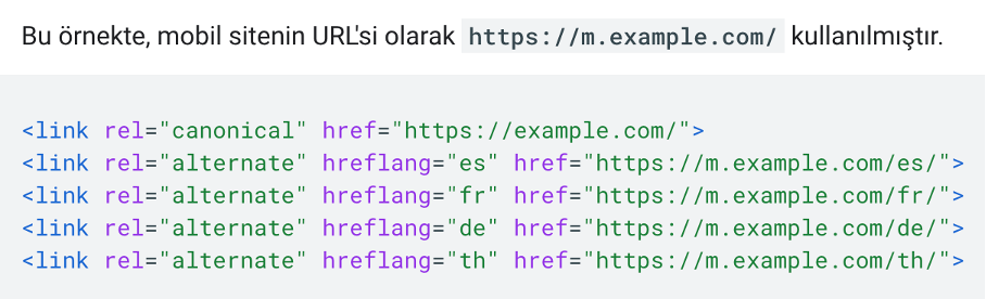
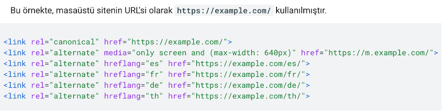
Control of Hreflang Links
Separate hreflang tags should be used for mobile and desktop site versions with separate URLs. For the mobile site version, hreflang mobile URLs should be pointed to, and for the desktop site version, hreflang desktop URLs should be pointed to.
The hreflang tag markup for the mobile site is as in the example below.
The hreflang tag markup for the desktop site is as in the example below.
Search Console Connection Control
If you are using a different URL structure for the mobile version, make sure to connect both your mobile site and your desktop site to Google Search Console separately to ensure you are getting the correct data flow for both site versions.
Error Pages Control
Make sure that a page that is presented as an error page on your mobile version is also presented on your desktop version. Otherwise, your page will not be indexed due to the error page shown on the mobile version.
Track URL Control
Fragment URLs are part at the end of the URL that contains a #. Fragment URLs cannot be indexed, so make sure that fragment URLs are not used in the mobile site version, otherwise, your page will not be indexed due to the fragment URL in the mobile version.
Canonical Label Usage Control
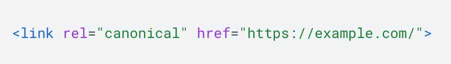
If you use a different URL structure for the mobile version, make sure that the correct canonical tags are used between the mobile and desktop versions of your website. The desktop URL is always the standard URL and the mobile version URL should point to the desktop version.
The URL https://m.example.com/ for the mobile site should use the canonical tag as in the example below.
Site Speed Control
As stated in the update made by Google, the fact that the results on Google are now determined over the mobile version brings mobile site speed to the forefront for us. All site speed improvement processes performed for the desktop version should be performed for the mobile site.
Mobile-First Indexing is an update that will be extremely beneficial for websites that offer a smooth mobile experience and have the same content on both mobile and desktop devices. As Google stated in the updated text, the increasing use of mobile devices and the increasing rate of access to the content offered via mobile devices will make the concept of mobile-first indexing (MFI) and mobile version improvements more important.


